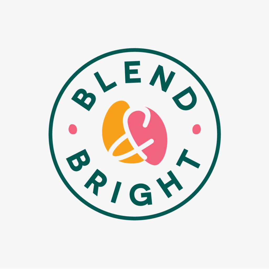
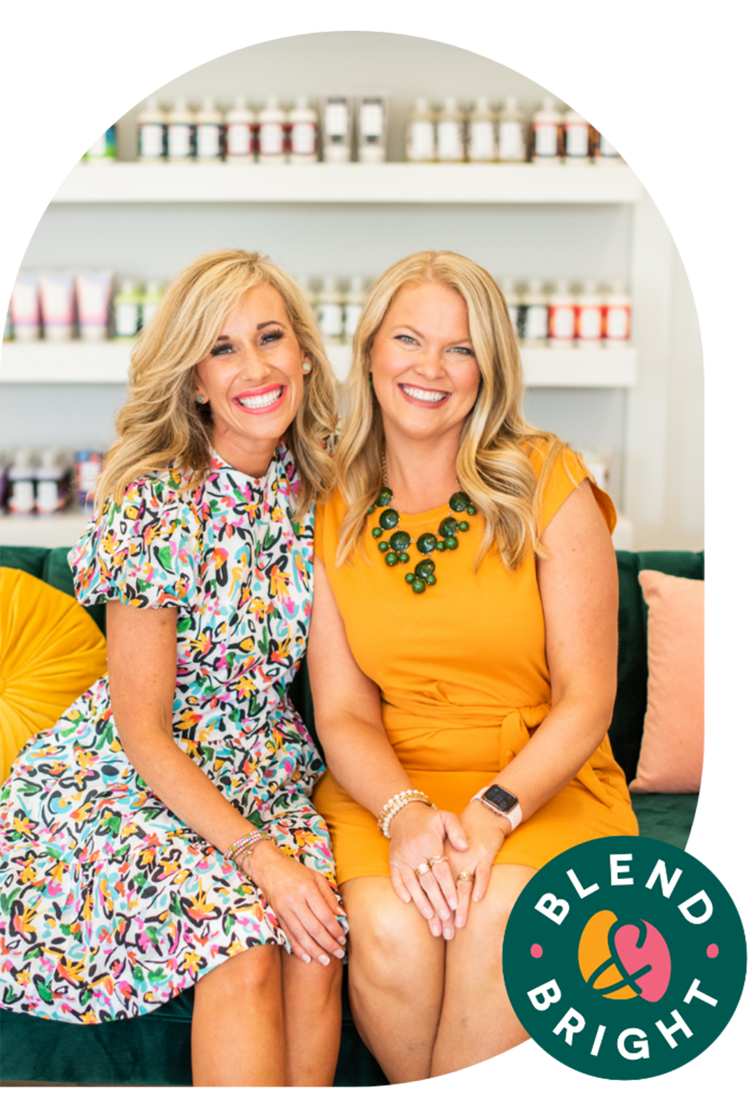
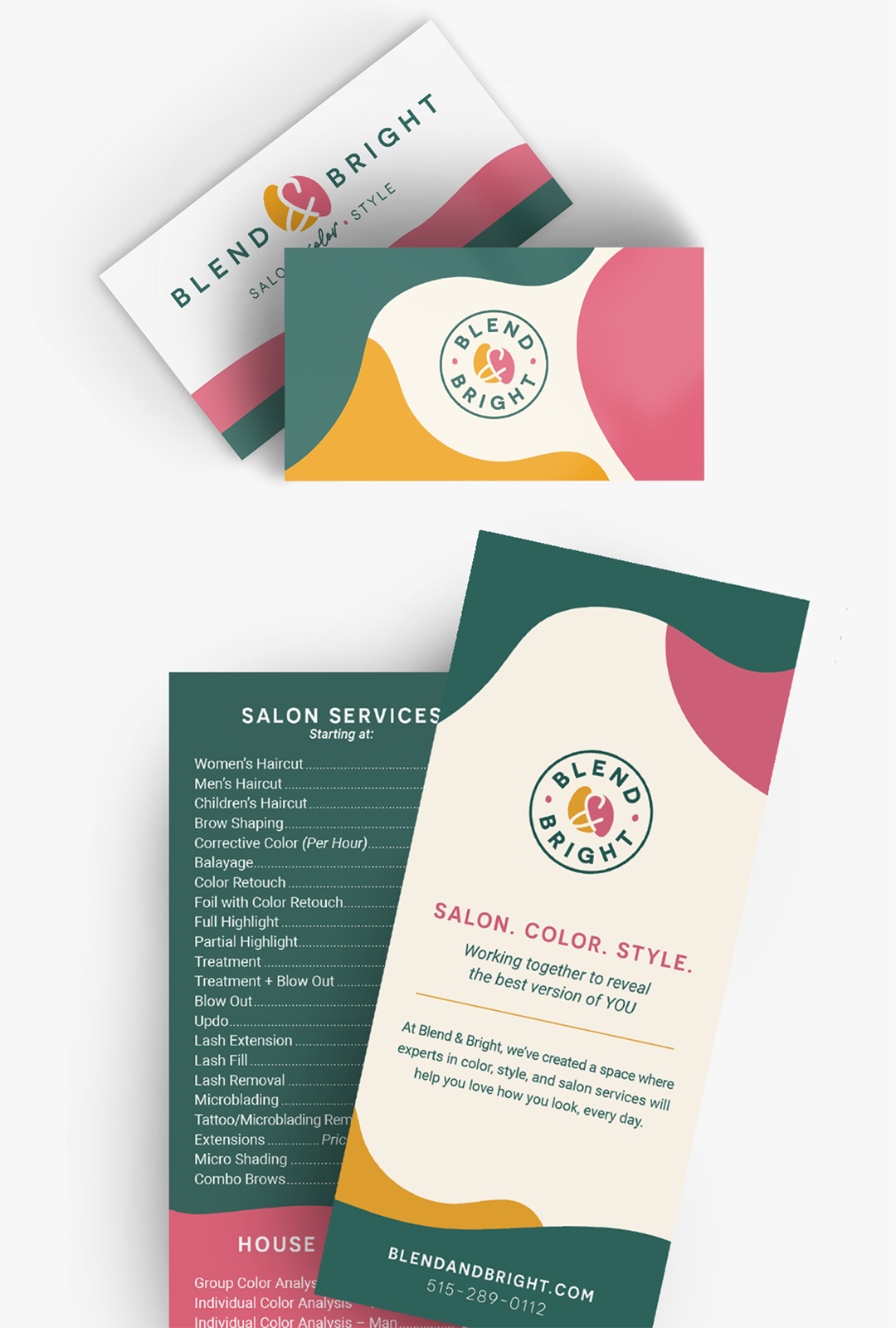
Blend & Bright is an innovative combination of House of Colour style and color analysis classes and salon services. This awesome mashup created a fun challenge for the Project7 Design team. Blend & Bright needed a logo that could fully represent the two businesses coming together under one roof. The logo mark uses two organic shapes, overlapping to create the ampersand with whitespace and illustrates the combined businesses. A horizontal version as well as a badge mark are used interchangeably for this brand. The organic overlapping shapes from the logo are imitated in patterns that are used across print materials, the website, and more. This design element also inspired curved images and background containers on the website.
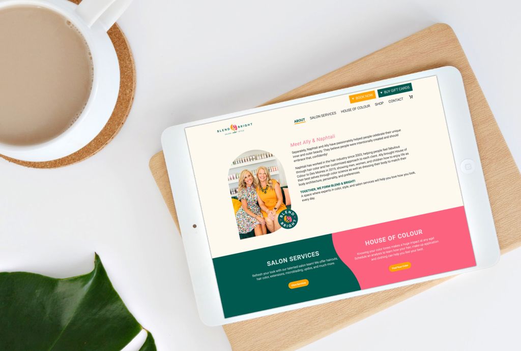
In addition to branding, p7 designed print materials like business cards and a printed services rack card for Blend & Bright. A fully responsive website was the final piece of this project, which helped integrate the stylistsʼ booking links, allow for online shopping, and more. A unique, custom icon system was designed to represent each service offered and is used throughout the site. From the organic shapes pattern to the colorful business cards to the website, this brand shines bright.
Project7 Design was so wonderful to work with. The designs, branding, and website they created for us exceeded our expectations by far! We could not love our website more. They are so creative and yet also incredibly organized. They definitely have the perfect balance on their team to create the best results for their customers. We love them so much we have already sent friends there for marketing and logo help. We are so grateful for the work they did for us and for their guidance in helping us know what we needed to do to build an online presence for Blend & Bright.
Naphtali Crouse
Blend & Bright, Co-Owner


